
On the front page of today's NYT Julie Bosman's "Selling Books by Their Gilded Covers" outlines the newly [re]trending wisdom that sees publishers making books more beautiful again as readers elect highly designed print objects in making print purchases. The photo accompanying the NYT article features Design Sponge at Home, which I picked up off a cart at the library yesterday, after it caught my eye with its clean red heft. I didn't take it home with me (even on loan) but I did file it away as a book to pick up in the future, and it only darted onto my radar via its physicality.
On Thursday I met folks from my writing group at an edition of the Chicago Artists Resource/At Work Forum hosted by Chicago Publishes: “What Makes a Beautiful (and Marketable) Book?”A panel comprising three professionals working in different areas of print publishing discussed the question of beauty versus marketability; though the discussion was framed to look at tension between the two concerns, the panel members pretty immediately established that today, due in part to competition from e-books/readers, "print design matters more than ever." Representing the marketing perspective, Ellen Gibson, Regional Marketing Manager at the University of Chicago Press was quick to illustrate this with examples from the UC catalog, from the ubiquitous Chicago Manual of Style remade to a sharp new edition of The Iliad. Jill Bough's Donkey, also pictured below, was not mentioned, but I discovered it on the UC site as they distribute the Reaktion Books Animal series. Love it. Now I can add all forty-seven heavily illustrated species-scopics to my wishlist, from Charlotte Sleigh's Ant to Garry Marvin's Wolf.


Gibson also discussed two very appealing illustrated guides to Field Museum collections of insects, spiders, and insect and bird architecture from Illinois, featuring paintings by Peggy Mcnamara.The two books are significant in that the slightly spendier hardcover second volume found more sales than the more affordable first volume, released with a handy flex cover common in field guides (both have now been added to my to-give Christmas list).


James Goggin, designer and Director of Design, Print and Digital Media at the Museum of Contemporary Art here in Chicago projected a number of very cool covers from highbrow mass market editions of culture/media/art/fiction (now) classics sporting the sleek mod designs that keep people talking (and blogging) about them decades after.


Goggin used this edition of The Medium is the Massage [Smashing Magazine on McLuhan and the message today] as an example, along with a couple of Bucky Fuller books. He did not use Dreadful Summit, but I found it while I was poking around (amidst a nice collection of vintage Penguin and Pelican compiled by an Italian designer I don't know, Paulo Gabriel). Goggin's design for The White Boy Shuffle shows that his love of type and a classic era of book cover illustration pay off in the contemporary.

Goggin quoted Clive Thompson and Charles Eames to the point:
We need to stop thinking about the future of publishing and think instead about the future of reading. —Thomspon, Wired, May, 22, 2009
I don't remember being forced to accept compromises, but I've willingly accepted constraints. —Eames
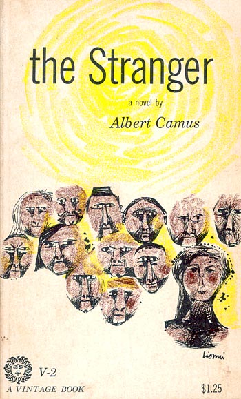
Annie Heckman, artist, book designer, and founder of Stepsister Press, started off talking about the use of a well-known paperback edition of The Stranger in the film Jacob's Ladder, to get at the idea of the individual bonding with books (and other objects) as a significant act of identity and connection. Then she showed a diversity of cover design interpretations. Heckman asked how many people in the audience had read The Stranger and I was surprised that only around half of the hundred or so bookish crowd raised their hands (maybe it was an issue of issues with hand raising?).

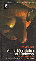
Next, Heckman went on to show an array of covers for H.P. Lovecraft's At the Mountains of Madness (see top) to the same point (I hope Guillermo del Toro gets to make his adaptation of ATMOM!). Going into the slide show Heckman asked how many in the audience had read Lovecraft, and my friend Ted and I raised our hands. That's pretty much it. It's hard to imagine that Lovecraft readers would be unwilling to "represent." I am only a mild fan, but by chance my group was to be looking at a rough draft of a new poem of mine titled "call of cthulhu" (about the strangeness of reading fiction about horrible incidents in order to escape daily life) later in evening. Possibly, this coincidence had shifted the balance of the universe and any small legion of fellow Lovecraft readers had been kept away lest the weight of us be too much. . . .
Stay tuned for my parade of mouth-watering Christmas-list books!
One of Heckman's animations, ruminating on a decomposing mouse, change in general, Becoming Formless (Heckman's animation YouTube channel):
No comments:
Post a Comment