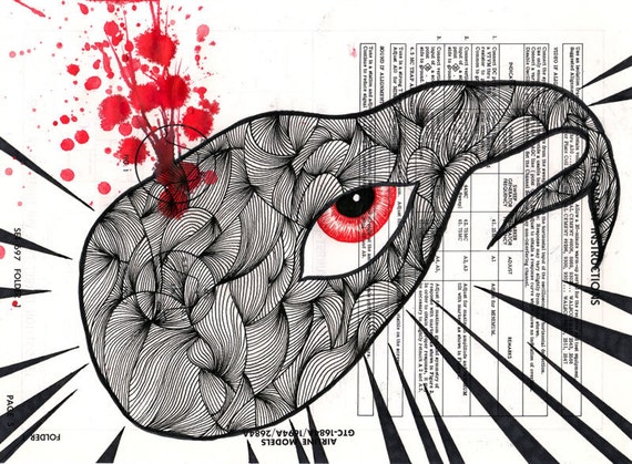
Turn your iPad into an avant gallery/library/listening station via UbuWeb, where you can watch experimental films, like Annika Ström's "All My Dreams Have Come True" (2004), above, in which her mother and uncle discuss how to say "all my dreams have come true" in English; and download super poetry, like Ron Silliman's "Sunset Debris." May all your electronic devices stimulate versus sedate (except when you are preparing for sleep, coming down from an anxiety attack, and other exceptions).
Recently saw Ron Silliman read at the Poetry Foundation. Best for hearing Ron read from "Sunset Debris," a long poem in questions. I went home thinking about crafting questions, and thinking about what happens in juxtaposing questions. "Sunset Debris" deftly had Kennedy and I in stitches, then pensive, inward-turning, then pulled us back out again, rolling us through a nuanced, diverse gamut of emotions and considerations, love, trash pick-up, sexual function and dysfunction, and other topics popularly and unpopularly handled via language.
I wish everyone in the world could write/dictate a poem in questions, and then all the questions could be compiled, into the longest poem in the world. What a collaboration. It would take a while to catch up with everyone, prioritizing folks on their deathbeds, so that their questions can be included, and finishing up with advanced and post-toddlers, whose iterations could provide crucial sub-volumes' worth of "why." (A real planning problem: where and when to end?) Even if the world population's contributions ran a single page per individual versus Mr. Silliman's fifty we would end up with a massively cool, endlessly intriguing document of human awareness in time and space. And someone or some people could spend the rest of their lives reading the global magnum opus.
"Sunset Debris" also got me thinking about blindness, blind poets, blind poetics. Wondering what the title would mean/feel to a blind reader/listener; and about the experiences of the blind reading/hearing poetry, sightless relationships with literary imagery, "Sunset Debris" relying less on imagery than many types of poems, but the magic of the title occurs in a brainswirl that includes visuals for me.
Thank you, Frame, for introducing me to one of the four corners of the earth, Fogo Island, and the Fogo Island Arts Corporation. The Arts Corp commissioned studios to house artists in residence and Norway-based architect Todd Saunders is doing a bang up job, perching mind-blowing little livables within Fogo's intimidating natural beauty. (If you enjoy architecture at all, be sure to check Saunders' other work on his website.)
The Bridge Studio, Long Studio and
Bridge Studio
interior are pictured
above.
Check the Arts Corp website to see more
studios
and past and current artists in residence.
Awe-inspiring, craggy, coastal, surreality-in-reality landscape? Check. Shelter as work of art? Check. Solitude? Remote-a-tude? Check. Unique local/international community arts interaction/collaboration? Check. Within hours of my first encounter, I started working on a project I hope to complete during a residency on Fogo. . . Poems about a place I have not visited, a series which I hope to complete by marrying them to poems written from that place at a later date. . .
In conclusion, I had to include "Parasitic Mind Control," as recommended by YouTube at the top of my search list of Annika Ström vids.
Everyone is tweeting the "Joy of Books" video today and it feels like it should have a place here. A husband/wife team live-animated the shelves/stock at Type Books in Toronto. The piece showcases the eye-candy quality of a room full of good print. And it is always fun to find a new bookstore. Now I have a bookstore to add to my list of destinations for an indeterminate future visit to Toronto. I hope to make it to the Toronto International Film Festival (TIFF) some year sooner than later. My entire previous Toronto experience comprises one night passing through, feeling lost after a few days in orderly, showy Montreal; still, we managed to find a great meal in one of Toronto's Chinatowns, and stumbled onto a free Lila Downs concert at the Toronto Harbourfront Centre. Then we slept in the van.
A congruence of animations, animated books, creative couples, and our old friend book design: Last night I was finally introduced to Marcel the Shell With Shoes On. Somehow I missed it while 15 million + others were melting in the face of monumental cuteness. If you're like me and you're late to this party, watch adorable Marcel now!!! Marcel might even be certifiably poetic (in my book): "Guess what I use for a hat? A lentil." The word "lentil" is almost a little, round poem unto itself. And maybe the thing we call "lentil" is too.
Naturally, I looked up the people responsible. "Co-habitating couple" Jenny Slate and Dean Fleischer-Camp created Marcel together, and on filmmaker Fleischer-Camp's website I noticed he had directed an intro for comedian Patrick Borelli's one-man multimedia show, "You Should Judge a Book By Its Cover." Borelli, a former book designer, critiqued bad book cover design for laughs; he conceived the show for a library audience in 2009 [sic?] and took it to American Institute of Graphic Arts (AIGA) conferences across the country. The intro didn't do much for me (perhaps my expectations were too high coming straight off The Shell) but a cool interview clip from Borelli's show (also directed by D.F.-C.) features author/artist/designers Steven Heller, Rodrigo Corral, and Chip Kidd, and the covers selected and comments from the designers evidence the subjectivity involved in pinning down "bad," let alone "good."
In an A.V. Club interview with Borelli, the much-mocked How to Avoid Huge Ships is singled out to exemplify bad bookdom. I found myself taking issue with this particular skewering. There are so many jokes about this book afloat on the internet that it's difficult to find serious references. I get it. But, I thought, if there's a book about it, maybe avoiding huge ships is actually pretty difficult, once you're in a situation where such action is necessary. And if so, then I certainly want the person responsible for keeping me out of collision with a huge ship to know exactly how to prevent the disaster. The cover design is not that bad. Plebeian. Unsurprising. I've seen worse. Okay, I might even feel attracted to it. (At any rate, I hope that author Captain John W. Trimmer benefited in some way from the maelstrom of fun-poking.)
Borelli suggests that a bad concept makes a book design bad, but the two are so different to my mind, although related in a stimulating way in the best books as objects. I have personally owned some pretty bad books, in terms of content, that
were just so great to look at that I got suckered in. And then, who are the concept police? In the Borelli/Heller/Corral/Kidd video linked above, Cooking with Pooh is brought out for discussion; I was glad to hear Heller back the idea that the book, though provoking, of course, chuckles in the adult demographic, is probably effective in reaching young Pooh-lovers.
At the end of the day, I do love what Borelli brings up in his own interview and the interview with other designers, about picturing all the parties involved in publishing a real stinker okaying the really sucky cover/book design. Just last night we were talking about television ads, the good and the ugly, and the corollary visualization in which I picture a group of decision-makers sitting around a table, agreeing, "Yeah, we'll go with that one." Such as the one that could turn a true Pepper off Dr. Pepper forever.
Matt Kish, illustration for page 357 of Moby-Dick; or, The Whale, from his book Moby-Dick in Pictures: One Drawing for Every Page, October,
2011, Tin House Books.
When I worked at The Bookworks we had a regular customer who came in for big books only. He called in advance and we set aside stacks of larger-than-average books in all categories. Photography, art, cooking. Gardening, exercise, film. Compendiums (big compendiums only). The selected big books were taken abroad for our customer's foreign customers, all of whom were looking for big American books. (If you're in Chicago, Bookworks is a great stop for Christmas
shopping—great deals on recently released books in perfect condition, classics and oddities of all description, a careful selection of books big and small.)
I was just in The Book Table in Oak Park and had to exercise great restraint to keep myself from "picking up" Matt Kish's Moby Dick in Pictures: One Drawing for Every Page. This book is now on The A List. What a fantastic, imagination-tickling, satisfying book. This big beauty would be a perfect gift for artists, sure, and for fans of
Melville, literature generally, illustration, art, design,
process, personal challenges. This book will delight a motley yet sophisticated lot of folks. The trailer from publisher Tin House gives a tasty taste:
Kish's undertaking is the fruit of an ambitious self-generated art prompt, and the proof in the prompt pudding. Prompts are just ideas laid out like scaffolding and this is the kind of project that can niggle a lot of fellow artists/writers toward conceiving some tapping framework to encourage the creative sugar sap to flow. Though not evidencing Kish's fab use of color, the image below is one of my favorite illustration/quote pairings, not in the least because it selects such wonderfully poetic lines to sketch (there are so many cool drawings, so there are lots of favorites):
"But far more terrible is it to behold, when fathoms down in the sea,
you see some sulky whale, floating there suspended, with his prodigious
jaw, some fifteen feet long, hanging straight down at right-angles with
his body, for all the world like a ship's jib-boom." -Moby-Dick, Herman Melville. Page 322 Artwork by Matt Kish.
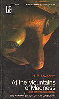
If you're not close to Oak Park's book Table, you can order Kish's leviathan direct from Tin House as well. And check out Kish's website, blog, and Etsy shop for projects, his notes on process, and wonderful art for sale at incredibly low prices. I was reading some of Kish's blog before posting on this and particularly enjoyed his posts on book covers (appearing first on the Tin House blog). Kish's love of vintage mass market fantasy covers comes through in the Moby-Dick illustrations. I love that his Dec. 16 post touts one of the H.P. Lovecraft covers that Annie Heckman included in her contributions to the Chicago Publishes What Makes a Beautiful (and Marketable) Book? forum I wrote on recently (I highlighted two of the other Mountains of Madness covers Heckman showed; Lovecraft obviously inspires visual artists).
I've run the clock down so my 12 Days of Christmas Books posts will serve multiple/overlapping category offerings these days. . . .
Also tempting at The Book Table, India: The Cookbook, the fourteenth cookbook authored by Professor Pushpesh Pant, is an appealingly big book in its own right, packed in a printed, rice-carrier-style bag. With heft and the great design that characterizes publisher Phaidon's catalog, India: The Cookbook covers all of India's diverse cuisine regions and compiles Pant's twenty years of culinary research. (Cookbook, big book, compendium.) The book garnered the award for 'Best Indian Cuisine Cookbook in the World' at the 2011 Gourmand Cookbook Awards.
Pant's newest also shared the NYT's list of the year's best cookbooks with At Home with Madhur Jaffrey. I have a few Indian cookbooks and like to cook Indian somewhat regularly. I've turned to my text-only Madhur Jaffrey's Spice Kitchen: An Introduction to Indian Spices in 50 Simple Recipes
nineteen times out of twenty over the course of the last twenty years when cooking Indian; I usually require pics, but this little sampler has me and my other very fine Indian cookbooks sit on the shelf, perfectly clean, virtually unused. I have given Jaffrey's cookbooks as gifts many times. One friend
still thanks me for his Jaffrey cookbook eight years later. So, experience tells me that I don't need a new Indian cookbook. Still, India handsomely commands immediate "must-have" status.
Fish in Red Chili Chutney, India: The Cookbook (via http://www.indiawest.com)
The IndiaWest online community Web site features a few recipes from Pant's India; if you're finicky about cookbooks and not drawn in by looks alone you can try one or two dishes before committing. Make a warming winter fish dinner, using Great Lakes whitefish:
Fish in Red Chili Chutney Origin: Coastal
Preparation time: 25-30 minutes, plus standing time
Cooking time: 15-20 minutes
Serves: 4
Ingredients:
1 lb 10 oz skinless, firm white fish fillets, trimmed
1 tablespoon vegetable oil
salt
For the marinade
1 level teaspoon ground turmeric*
4 cloves garlic, crushed
1 tablespoon lime juice
½ teaspoon sugar
For the red spice paste
6 dried red chilies
1/3 cup dried flake coconut
1 teaspoon malt (white) vinegar
* turmeric is a spice made from the rhizome of the turmeric plant,
which is ground to make a bright yellow powder. It has a warm, dry
flavour and is found in almost all curries and pickles. It also has
antiseptic properties.
Cooking Instructions:
Mix the turmeric, garlic, lime juice, sugar and a little salt
together in a bowl. Put the fish in a large shallow dish and rub the
fish with the turmeric mixture, then cover and set aside in the
refrigerator for 30 minutes.
To make the red spice paste, put the dried red chilies, desiccated
coconut and vinegar in a food processor or small blender and process to
make a paste, adding a little water only if necessary.
Heat the oil in a pan over high heat, add the red spice paste and
stir-fry lightly for about 1 minute, ensuring the bright red colour is
not lost due to browning. Reduce the heat, add the fish with ½ cup water, stir and simmer for 7-8 minutes, or until the
fish is cooked.
As soon as Frame Publishers' Frameweb newsletter pops up in my inbox I minimize any paid-work windows and take an invigorating break to check out their new art/architecture/design beauties. Today's brought wind of Jonathan Harris'sBalloons of Buthan, in which the artist seeks to measure happiness using balloons as a quantitative measure, on a scale from one to ten. Immediately above, "Restaurant owner Khandu shows his level of happiness." The photographs are captivating, and at the Balloons of Bhutan Web site Harris has created a deeper interactive multimedia exploration, including interviews, audio, and statistics. Each of the 117 participants also wrote a wish on one balloon, and the balloons were strung along prayer flags at the conclusion of the project. While the colorful balloons make for whimsy and cheer, the material does not avoid the more bittersweet stream that courses through the study. One man's balloon wish reads, "I want to go with you so I have a place to live." And when we see participants holding fewer than five balloons, we are able to presume (with an admixture of relief) that Harris hasn't fluffed up the happiness level of the Himalayan characters who are his subject (along with happiness and other more general and elusive states and measures).
Check out Harris's website (linked above) to see his webby/tech-related art/thought and photo projects, and to peek into his handwritten, handdrawn sketchbooks.
I meet people. One at a time they step inside me and live inside me.
Some of them only for a moment, some stay. They set up wherever they
want to and take my facial expressions or my leg's resting position and
put their own in their place. They lie on my back and press their toes
into my Achilles tendons. They appear in every pause and come out when I
am in doubt and fill all the empty space. I shake and say to myself for
a long time: good, really good. —Talo/The House
A month back I saw "Talo/The House" (2002), a three-channel video installation by Finnish artist Eija-Liisa Ahtila, at the Art Institute. Ahtila drew on research and interviews with individuals suffering psychotic disorders for her work, which is rendered with high production values, pretty sets and mise-en-scène, to make a dreamlike experience for a viewer, one part Anthropologie, two parts Roman Polanski. The dream bridges the divide between those Ahtila interviewed and the viewer on the bench in a darkened room in the corner of an art museum. I looked Ahtila up and read a NYT piece on an exhibition that came down Dec. 3.
Marian Goodman Gallery was showing two projections: "The Annunciation," enacted by non-actors (all women, excepting one, who had experienced addictions); and "Horizontal," which NYT writer Ken Johnson described as "representing a tall spruce tree rotated 90 degrees . . . six vertical projections, each showing a section of the tree, it spreads more than 35 feet across one wall. With its wind-blown branches heaving and swaying and its trunk whipping up and down, it looks more animal than plant, as if it were a great, arboreal whale." Sounds great. There's never enough (really top) video art around.
So, when that week's Frameweb email came through featuring Pipilotti Rist, my longtime (once?) favorite video artist, I went from, "Oh, I guess I won't unsubscribe," to "Now I definitely won't unsubscribe." The newsletter and website feature an agenda section that trots out mentions of a fine stable of very contemporary artists. I was lucky to catch a Rist installation in Chicago soon after moving to the city (maybe "Sip My Ocean"?), and then saw and loved "Ever Is Over All," a giant-flower-smashing-car-windows number at MOMA a few years later—uncannily, giddily uplifting (a bit of a reenactment below). The "Agenda" covered her first solo show in Italy, ending this weekend.
The divergence . . . I am
actually touting a magazine here, versus a book; a magazine available in a digital format no less (in addition to print, but given the cost of international subscriptions a digital option is a coup). Definitely peruse Frame's books offerings;
if you have a serious interior designer on your gift list you can pull
out the stops and make his or her season. But for uber-contemporary art lovers who blur the "line" between fine art and applied arts and design, a subscription to ELEPHANT is in order.
Visit Dawsons' Bookshop online for rare books, particularly art, photography, and So-Cal/Western Americana history, and for awesome fine art photography. Seriously cool stuff. If you are not sure what you're looking for, sign up to receive the Dawsons' emails right away and you will receive periodic highlights from the collection for sale (not too many and always intriguing; you'll be glad to find these in your inbox).
There are offerings to suit most wallets. From more humbly fascinating items like Marcia Rittenhouse Wynn's turn-of the century stories set in the Upper Mojave Desert in a first edition (1945) with a gorgeous screenprinted cover (above), to "the post-Provoke masterpiece of Japanese photobooks," Masahisa Fukase'sKarasu (Ravens) (below).
Proprietor/curator Michael Dawson also offers museum quality art photographs. Photographers represented range from the iconic, including Ansel Adams, to deserving lesser-knowns. Currently the Web site features the Sanford H. Roth collection; Roth moved from New York to Paris where he fell in with and photographed the culturati who would become lifelong friends, including Colette, Picasso, and Cocteau. Roth went on to photograph film stars in Hollywood and Eurpope, becoming famous for his portraits of James Dean.
Timothy H. O’Sullivan, Black Cañon, Colorado River, From Camp 8, Looking, Above, 1871, Albumen print, Library of Congress, Prints and Photographs Division. Check out the Art Tattler International Web site for a great preview.
Day one in twelve days of books from my wishlist.
Two gorgeous photography books available in the Art Institute gift shop, good for a destination shopping trip.
Check out the exhibit: Timothy H. O'Sullivan: The King Survey Photographs. Then pick up the book: Framing the West: The Survey Photographs of Timothy H. O'Sullivan for any fans of photography generally, history, Western Americana. General book and art lovers should find interest in O'Sullivan's photos too; much of his work finds men (and their essentials and accoutrements for survival and exploration) dwarfed within awesome, overwhelming landscapes, beautiful, certainly, and the images are charged with a current of foreboding. Both the "pure" landscapes and views incorporating the human form similarly suggest stories and spark the imagination.
Richard Misrach is a longtime favorite. Misrach's 2010 book Destroy This Memory looks at post-Katrina New Orleans. Misrach's eye is unique, his technique is dropdead gorgeous (let's just say he is considered responsible for "bringing color photography back"), and his subjects are meat and gristle, so his books are all substantial, worth the investment and deserving permanent shelfspace, as the images bear ongoing examination.
In his Modern Art Notes for the Artinfo blog, Tyler Green describes Misrach's gestalt for his Katrina book: "Misrach’s book focuses not on the totality of the devastation but on
one way New Orleanians responded to it. . . . New Orleanians
spray-painted messages on their homes, cars and propped-up boards of
plywood. The graffiti are warnings, announcements, pleas and even sly
jokes shared with neighbors, government, city officials and neighbors.
They are among New Orleanians’ first written responses to their hell."
According to Green: "Misrach didn’t just make his pictures into a book, he printed them and
gifted full sets of prints to five museums that serve as storehouses of
our visual record of ourselves and our culture: the Museum of Modern
Art, the National Gallery, the MFA Houston, SFMOMA and the New Orleans
Museum of Art. Misrach is also donating the royalties from book sales
to the Make it Right Foundation, which is active in the Lower Ninth Ward of New Orleans. (Readers may also click here to give to Make it Right.)"
If you're not in Chicago, or you can't make a visit to the Art Insitutitue, Destroy This Memory is offered at a nice sale price via the publisher at: Aperture Foundation (while you're there, if you subscribe to the magazine, at a 50% discount, you get a free copy of Aperture's Masters of Photography series: Paul Strandwith your subscription).
On the front page of today's NYT Julie Bosman's "Selling Books by Their Gilded Covers" outlines the newly [re]trending wisdom that sees publishers making books more beautiful again as readers elect highly designed print objects in making print purchases. The photo accompanying the NYT article features Design Sponge at Home, which I picked up off a cart at the library yesterday, after it caught my eye with its clean red heft. I didn't take it home with me (even on loan) but I did file it away as a book to pick up in the future, and it only darted onto my radar via its physicality.
On Thursday I met folks from my writing group at an edition of the Chicago Artists Resource/At Work Forum hosted by Chicago Publishes: “What Makes a
Beautiful (and Marketable) Book?”A panel comprising three professionals working in different areas of print publishing discussed the question of beauty versus marketability; though the discussion was framed to look at tension between the two concerns, the panel members pretty immediately established that today, due in part to competition from e-books/readers, "print design matters more than ever." Representing the marketing perspective, Ellen Gibson, Regional Marketing Manager at
the University of Chicago Press was quick to illustrate this with examples from the UC catalog, from the ubiquitous Chicago Manual of Style remade to a sharp new edition of The Iliad. Jill Bough's Donkey, also pictured below, was not mentioned, but I discovered it on the UC site as they distribute the Reaktion BooksAnimal series. Love it. Now I can add all forty-seven heavily illustrated species-scopics to my wishlist, from Charlotte Sleigh's Ant to Garry Marvin's Wolf.
Gibson also discussed two very appealing illustrated guides to Field Museum collections of insects, spiders, and
insect and bird architecture from Illinois, featuring paintings by Peggy Mcnamara.The two books are significant
in that the slightly spendier hardcover second volume found more sales
than the more affordable first volume, released with a handy flex cover
common in field guides (both have now been added to my to-give Christmas
list).
James Goggin, designer and Director of Design, Print and Digital Media at the Museum
of Contemporary Art here in Chicago projected a number of very cool covers from highbrow mass market editions of culture/media/art/fiction (now) classics sporting the sleek mod designs that keep people talking (and blogging) about them decades after.
Though the inexpensive, highly portable editions Goggin is influenced by disappeared in the States after their heyday in the '60s and '70s, the Japanese mass market bunkobon format continues to thrive (typically used for novels). Goggin brought in an example, pointing out that the tiny book proffered both slipcover and built-in ribbon bookmark, and used a bunkobon edition of Yukio Mishima photographs as an example of the range of subject matter deemed appropriate for publication in the format. I couldn't find a good history/overview of bunkobon to link to, but I did find Obun Printing, a company that sells "Designer book covers: T-shirts for your books. . . . for small-format paperbacks (bunko-bon) and for slightly larger general-issue books (shinsho-bon)." Features listed on the website include: "our original emotional value printing." The Obun Web site is fun to explore; look for the monthly senryu.
We need to stop thinking about the future of publishing and think instead about the future of reading. —Thomspon, Wired, May, 22, 2009
I don't remember being forced to accept compromises, but I've willingly accepted constraints. —Eames
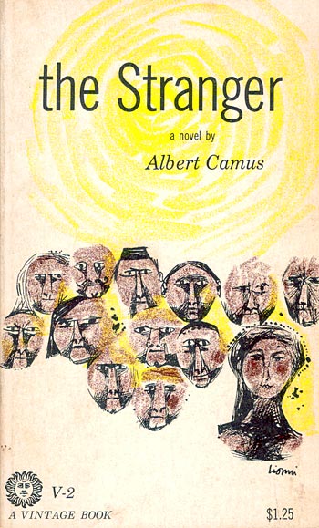
Annie Heckman, artist, book designer, and founder of Stepsister Press, started off talking about the use of a well-known paperback edition of The Stranger in the film Jacob's Ladder, to get at the idea of the individual bonding with books (and other objects) as a significant act of identity and connection. Then she showed a diversity of cover design interpretations. Heckman asked how many people in the audience had read The Stranger and I was surprised that only around half of the hundred or so bookish crowd raised their hands (maybe it was an issue of issues with hand raising?).
Next, Heckman went on to show an array of covers for H.P. Lovecraft's At the Mountains of Madness (see
top) to the same point (I hope Guillermo del Toro gets to make his adaptation of ATMOM!). Going into the slide show Heckman asked how many in
the audience had read Lovecraft, and my friend Ted and I raised our
hands. That's pretty much it. It's hard to imagine that Lovecraft readers would be unwilling to "represent." I am only a mild fan, but by chance my group was to be looking at a rough draft of a new poem of mine titled "call of cthulhu" (about the strangeness of reading fiction about horrible incidents in order to escape daily life) later in evening. Possibly, this coincidence had shifted the balance of the universe and any small legion of fellow Lovecraft readers had been kept away lest the weight of us be too much. . . .
Stay tuned for my parade of mouth-watering Christmas-list books!